WAE Mobile App
WAE (Work Available Everywhere) is a staffing start-up that helps connect employees sign up for work at several different companies. The mobile App is only available for employees.
The Project
I started working at WAE as the WAE App was in Beta testing. Throughout my time at WAE I worked on several App projects including:
Preparing the WAE App for the first launch in the App Store and Play Store
Reducing clicks and cognitive load for job sign up increasing adoption through the app by 90%
Introduced a self-service model for creating a new WAE account reducing set up time by 24-hours
Created an attendance tracking system that decreased no show rates by 98%
Designed an interface for employees to see their Reliability Score (using Machine learning) to determine work eligibility
Simplified the dispute time workflow to ensure timely pay and reducing payroll work load by 80%
Updated branding throughout App including components and started and maintained the brand library
Design Process
Updated branding including text boxes and button components
Added missing functionality for password reset and a workflow to create a new account
Updated WAE Privacy Policy and Terms and Conditions
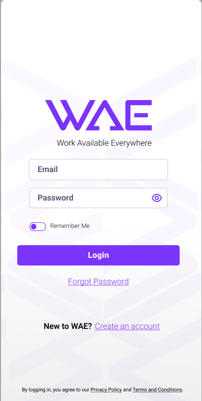
Login
New Login
My observation when using the App for the first time was the overwhelming feeling I had when I first logged in. The goal of the App is for users to sign up for work. I stripped away anything that didn’t directly apply to that goal.
If you are a new user, you will see the welcome screen until you sign up for your first job. If you’re a returning user, you will see the jobs you’ve signed up for on this home screen.
Welcome/My Jobs
Old Login

New User Welcome
New My Jobs
Old My Jobs/ Home
Providing at a glance view of the work schedule. The next shift will be listed at the top including all the information needed. Any other jobs scheduled for that week are shown below. Click the arrows next to This Weeks Schedule to see jobs scheduled in the upcoming weeks.
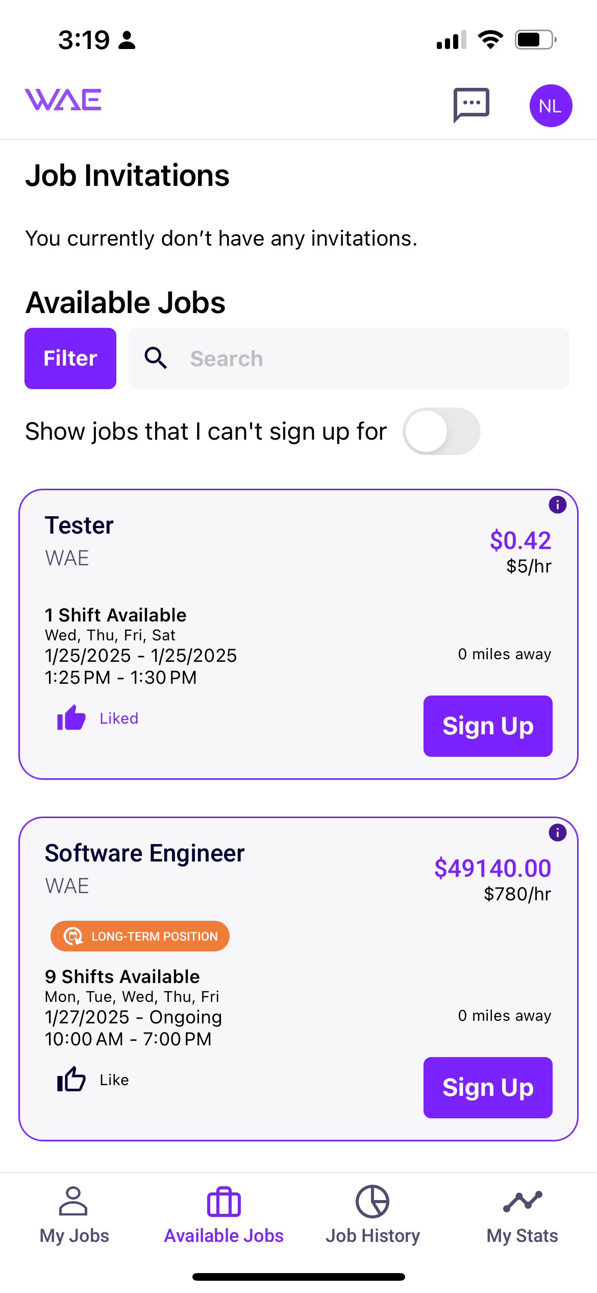
My Jobs
Removed the yellow alert banner at the top and added to a tool-tip next to hourly rate
Redesigned the Time to Clock In functionality to be incorporated into the Next Shift area at the top of the new designs
Simplified view by moving any worked or completed shifts to Job History
Added shift days and times to job card reducing clicks to find this information
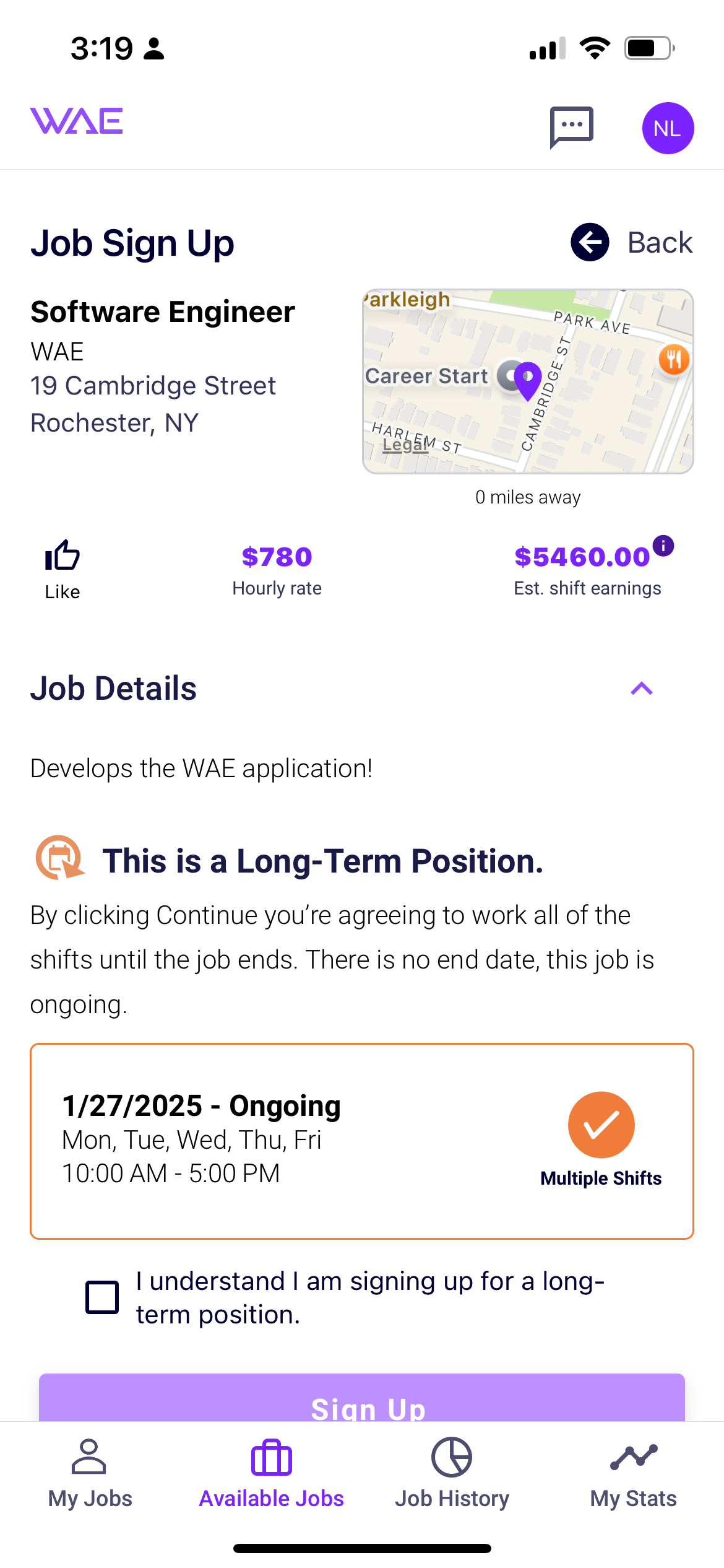
All jobs now have relevant details listed upfront. Users can now see the days, times, pay rate, and the commute time. Through user feedback I found employees were more interested in signing up for a long-term temp to hire opportunities. I created a tagging system to identify jobs that are long term versus single shift.
Available Jobs
Old Available Jobs
New Available Jobs
The goal of the App is for users to sign up for work. I was able to reduce the information to only what was needed allowing users to focus. In addition, the change to long term roles made the sign up workflow quicker and less complicated. The new workflow reduced drop out rates by 45%.
When it’s time to start a shift the Clock In functionality is located at the top of My Jobs. This is where the user will see their Next Shift until it’s time to start. This ensures all info needed is easily accessed.
Job Sign Up
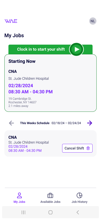
My Jobs Clock In
New Job Sign Up
Old My Jobs/Clock In